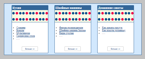
Пример #5
Карточки на Flexbox
Описание:
- В Примере #5 "карточки" располагаются по горизонтали (
class="flex__row") и меняют положение по мере изменения размера экрана (контейнера).
- В нутри "карточки" элементы располагаются по вертикали (
class="flex__col").
- Элементы в "карточке" располагаются так, чтобы элемент "кнопка" всегда располагался в низу "карточки" и не зависил от размера контента.
<head>
<style>
  * {box-sizing: border-box;}
  .container {
    max-width: 1200px;
    margin: 0 auto;
    padding: 0;
    margin-top: 50px;
    border: 1px solid #336699;
  }
  a {
    color: #336699;
    text-decoration: underline;
  }
  a:hover {
    color: red;
    text-decoration: none;
    cursor: pointer;
  }
  .flex__row {
    display: flex;
    flex-direction: row;
    flex-wrap: wrap;
    align-items: stretch;
    background-color: #d2e8fd;
  }
  .jus-center {
    justify-content: center;
  }
  .jus-between {
    justify-content: space-between;
  }
  .row-items {
    width: 302px; <!-- Размер карточки -->
    padding: 0 10px;
    margin: 10px;
  }
  .flex__col {
    display: flex;
    flex-direction: column;
    height: 100%;  /* важно! */
  }
  /* Карточки  */
  .col-item-top {
    /* background-color: #01316b; */
  }
  .col-item-end {
    /* background-color: #808cf8; */
  }
  .__card {
    border: solid 1px #336699;
    border-radius: 4px;
    background-color: #ffffff;
  }
  .but-more {
    padding: 20px 0px;
    text-align: center;
  }
  .but-more a {
    border: 1px solid #c9c9c9;
    padding: 5px 20px;
    border-radius: 4px;
    font-size: 14px;
    text-decoration: none;
  }
   .but-more a:hover {
    color: #ffffff;
    text-decoration: none;
    background-color: #003366;
    border-color: #003366;
  }
  .card__item_bg {
    margin: 0;
    padding: 0;
    background-color: #fafce5;
    background-image: url(images/site-demo5-bg.png);
    min-height: 80px;
  }
  .card__item_bg {
    border-bottom: 1px solid #336699;
  }
  .card__item-text {
    text-align: left;
    /* background: #faa55f; */
    padding: 10px;
  }
  .card__item-zag {
    background-color: #336699;
    color: #ffffff;
    font-size: 20px;
    font-weight: 600;
    padding: 4px;
  }
  .card__item-text ul {
    padding-left: 20px
  }
  @media (max-width: 767px) {
    .row-items {
      width: 100%;
      padding: 0;
    }
  }
</style>
</head>

<body style="background-color: #c2c2c2;">
  <div class="container"> <!-- контейнер -->
    <article>
      <div class="flex__row jus-center">

<!-- Карточка-1 -->
        <div class="row-items">
          <div class="__card flex__col jus-between">

            <div class="col-item-top flex__col">
              <div class="card__item-zag">
                Кухня
              </div>
              <div class="card__item_bg">
              </div>
              <div class="card__item-text">
                <ul>
                  <li>
                    <a>Стаканы</a>
                  </li>
                  <li><a>Бокалы</a></li>
                  <li><a>Мультиварка</a></li>
                  <li><a>Сервировка стола</a></li>
                  <li>. . .</li>
                </ul>
              </div>
            </div>
            <div class="col-item-end">
              <div class="but-more">
                <a>больше →</a>
              </div>
            </div>
          </div>
        </div>

<!-- Карточка-2 -->
        <div class="row-items"> . . .
        </div>

<!-- Карточка-3 -->
        <div class="row-items"> . . .
        </div>

      </div>
    </article>
  </div> <!-- контейнер -->
</body>
</html>
Результат Примера #5